![]()
Overview
The View Map tab is open by default in the Minimized and Maximized version of a Filter Widget.
This view will show the data displayed as a pin map.
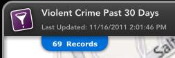
Record Count
Whether in the Minimized or Maximized State, the record count is visible at the top left of the map window.
The record count identifies the number of records that are currently being displayed on the map.
Record Count for Filter Widget
Panning and Zooming
Both Minimized and Maximized States provide panning and zooming capabilities within the map.
There are three options to zooming into the map when the widget is in Minimized or Maximized States.
To zoom into the map, left click the mouse, hold down the shift key, and drag the mouse to create a zoom window.
Another way to zoom into the map is to use the mouse wheel. Click on the map, and push the mouse wheel to zoom in.
A third way to zoom into the map is to double click on the map which will zoom the map one zoom level.
To zoom out of the map, click on the map, and pull the mouse wheel.
Heat Map
The heat map converts the point features on the map to a raster layer that displays the intensity of features in an area.
Zooming in or out of the map, recalculates the intensity based on the features found within the map extent.
The heat map layer may be toggled on or off in the Minimized or Maximized States.
In the Maximized State, the heat map transparency may also be adjusted.
Filter Widget Heat Map in Minimized State

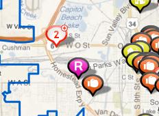
Clustering
Clustering is used to improve the display performance of the Dashboard when a large number of features must be displayed.
Data points are grouped together according to their location if they are in close proximity to one another.
Clusters are identified with a standard symbol which includes the number of data points in each cluster.
Clicking on a cluster on the map, zooms the map to a smaller scale where more feature clusters may be displayed.
Zooming into the map can be repeated until individual features are revealed.
Clustering occurs in both the Minimized State and Maximized State. Clusters may appear different however between the two states.
Filter Widget with Clusters in Minimized State

Stacked Features
Stacked features are identified by a different icon which includes the number of features at the same geographic location.
The number within the icon indicates the number of features found at that location.
The feature stack is different from the feature cluster; a cluster is a set of features which have occurred near each other, while stacked features occur at the same location.
Individual Icons
Maximized State
A Filter Widget in Maximized State has a number of features exclusive to the Maximized State.
Filter Widget in Maximized State

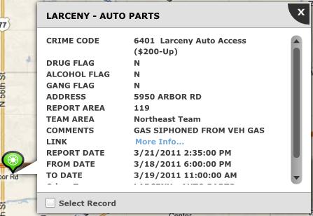
Identify Tool
One aspect of the Maximized State which is not available in the Minimized State is the ability to identify.
To identify a data point, zoom in on the map until clusters disappear.
Click on any data point to view the Attribute Table containing detailed information about that incident.
If you click on a location that contains more than one data point, you can scroll through the incidents using the arrows on the upper right side of the Attribute Table.
You can click the Select Record check box on the bottom left portion of the Attribute Table dialogue box to highlight the selected data point on the map. A blue halo will highlight the data point.
Attribute Table
Additional Record Details
Depending on your Dashboard's configuration there may be an Additional Details button on the Identify box.
The Additional Record Details button will display a dialogue box that will show even more information about the selected record.
You can scroll through the information using the scroll bar.
The Print button will let you print the information about the selected record.
The export button will let you save an excel spreadsheet with information about the selected record.
The close button will close the Additional Record Details dialogue box.
The Additional Record Details dialogue box.

The printer icon in the top right of the map will enable you to print certain features of the Filter Widget.
Clicking this button will bring up an options dialogue box.
You can include or exclude a report by using the Include Report check box. You can further choose to include only selected records.
The Include Map check box will let you print a Map as well.
The Include Charts check box will let you print charts. You can choose to print any combination of an Incidents (Pie) Chart, Day of Week chart and a Time of Day chart.
The include Widget Information will print certain information about the widget.
The Title field will let you enter a Title.
The Description text box will let you enter a description.
The Clear All button will reset your printing options.
Click the Print button to print.
Click the cancel button to cancel printing.
Printing Options Dialogue Box.

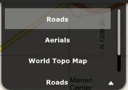
Base Map Options
You can change the base map type using the drop down menu in the top right corner of the map.
The choices you see will depend upon your Dashboard's configuration.
Base Layer Drop Down
Related Links:
© Copyright 2011 The Omega Group. All Rights Reserved.