![]()
![]()
Overview
The Response Time Widget in Maximized State has a number of features that are exclusive to the Maximized State.
Response Time Widget in Maximized State

Identify Tool
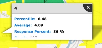
One aspect of the Maximized State which is not available in the Minimized State is the identify tool.
You can click on a geographic boundary to view the Name, Percentile, Average, Response Percent and the Count.
Identify Tool
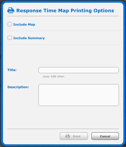
In the upper right corner of the map you can see the Printing icon.
Clicking on this icon will allow you to print certain features of the Response Time Map
You can choose to include the Map and/or Summary.
You can enter a Title and Description.
Response Time Widget Printing Options.
Base Map Options
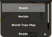
You can change the base map type using the drop down menu in the top right corner of the map.
The choices you see will depend upon your Dashboard's configuration.
Base Layer Drop Down
Overview
The summary tab displays information about each geographic boundary on the Response Time Map.
You can see the Color of the Boundary, the Name, Percentile, Average, Response Percent and the Count.
You can zoom to a boundary by clicking on the circular X icon.
You can sort the Summary by clicking on the Column Name. You can sort in either ascending or descending order.
The Summary Tab of the Maximized Response Time Widget.

Related Links: