![]()
Pin Map Charts & Report Tab
Pin Map Charts & Report Tab
-
The Charts & Report tab for a Pin Map Result Layer has a Report tab and a Charts tab.
-
The Charts Tab will allow you to use various charts to analyze the data that is being displayed on the map.
-
The Report Tab will let you view detailed information about the records in Query that is being displayed on the map.
-
The Charts Tab is open by default.
Charts Tab
Categories Chart
-
The Categories Chart is the first chart on the left of the tab.
-
This charting tool is fixed in this position and will always be visible here.
-
You can use the drop down menu to choose which Category to display on the chart.
-
Chart Selection Mode will let you set it so you can choose Multiple bars at once or only Single bars.
-
Clicking View Legend will flip the chart over and show you the legend for the Categories Chart. You can see each value and its corresponding color.
Day of Week/Time of Day Tab
-
The first tab on the right side of the Charts and Report tab is the Day of Week/Time of Day tab.
-
This tab displays both the Day of Week chart and the Time of Day chart.
-
Both charts are fully interactive. You can click on any bar to filter the results on the map or any of the other charts.
Charts Tab for Pin Map Results Layer

Temporal Grid Tab
-
The Temporal Grid tab will display a Temporal Grid for the selected data.
-
If no filter is applied to the Incidents Chart, the Temporal Grid will display all data in the widget by default.
-
If you have filters applied to the Incidents Chart, then only those will be shown on the Temporal Grid.
The Temporal Grid chart tab.

Ad-Hoc Tab
-
Depending on the configuration of your Agency's Dashboard, you may have an Ad-Hoc chart tab available.
-
The Ad-Hoc tab will display a chart that summarizes the number of records for a given field
-
A drop down list will display the different fields you Dashboard has been configured to use for Ad-Hoc Charts.
-
Clicking on a field in the list will display the Chart for that field.
The Ad-Hoc Chart tab

Time Sequencer.
-
You will notice the Time Sequence tab features a bar chart and to the right of the bar chart there is a Controls section.
-
You can use the slider on the bar chart to select your segment.
-
You can adjust your time sequence using the Animation Controls to the right of the time sequence chart.
-
Clicking the Play button starts the animation. Clicking the Pause button will suspend the animation until you chose to resume it.
-
The Forwards and Reverse controls will allow you to step forward or back one and jump to the end or jump back to the beginning.
-
The speed of the animation can be controlled with the Speed slider. You can choose between 2 and 10 seconds.
-
While animated, the data on the map can be shown in segmented fashion, or cumulatively. These apply to both the pin map and heat map. The radio buttons allow you to choose which method to utilize.
-
The direction of the animation may also be set using the Forward and Reverse radio buttons.
-
The last option is the Loop check box. When this is checked, the animation will look back to the start upon reaching the end of the data range.

Time Sequencer with the Charts & Report tab minimized.
-
-
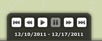
When you minimize the Charts & Report tab with the Time Sequencer active, you will notice in the lower right corner of the map there is a animation controls box.
-
This is a limited version of the full animation controls available on the expanded tab.
-
From here you can Play and Pause the animation. You can also jump forward or backward one, and jump the end or back to the beginning.
-
It will also show the date range of the data currently being displayed.
-
The Collapsed version of the Animation Controls.
Report Tab
-
The Report Tab will display a Table Report for the selected incidents in your widget.
-
You can cycle through the pages of the Report using the page controls in the top left portion of the Report tab.
-
The Options... button will allow you to Clear Selection, Switch Selection, Zoom to Selected, Export Selected, Export All and Auto-Zoom to Selected.
-
You can select a record by using the check box to the left of the report fields.
-
You can zoom to selected by using the crosshairs button next to the check box.
-
You can sort the Report by clicking on a column name or by dragging and dropping a column to the area that is titled "Drag a column header and drop it here to group by the column."
Analysis Mode with a Pin Map Result Layer selected and the Charts & Report tab expanded.

Related Links:
© Copyright 2011 The Omega Group. All Rights Reserved.