Density Widget
What is a Density Widget?
-
The Density Widget displays the data as a density map by showing the density of incidents within pre-defined geographic boundaries.
-
The number of incidents that occurred in each boundary will be displayed on the map.
-
The color of each boundary will change in intensity depending on the count of incidents in that boundary.
How does the Density Widget work?
-
The Density Widget provides a map and table of results with which to view the results of a query.
-
The thematic map uses the count or density values to classify each geographic boundary into a particular category.
-
Each category is color coded so that the variability between boundaries can be easily differentiated.
-
A table of results is generated with the map to provide a tabular view of the statistics for each geographic boundary used in the query.
Minimized State
-
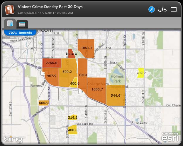
The Density Widget icon is the first feature of Minimized State to take note of. You will always find the widget type icon in this location.
-
Next to the Density Widget icon you can find the Widget Name and the Last Updated date.
-
On the right side of the Density Widget you can see the blue Analysis Mode 'A' icon. Clicking this will open the widget in Analysis Mode.
-
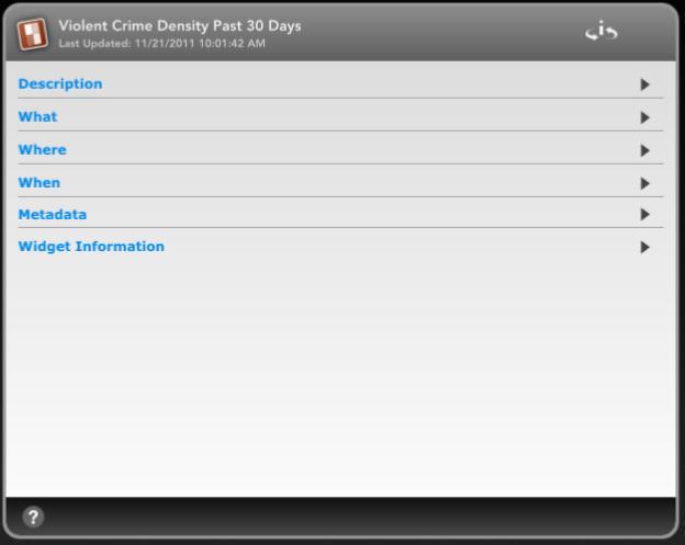
Next is the 'i' icon with two arrows around it. Clicking this will flip the widget and show you information about the widget including Description, What, Where, When Parameters, Metadata and Widget Information.
-
Next is the Window icon. This will open the widget in its Maximized State.
-
Next on the Density Widget, below the Density Widget icon and title, you will see two tabs.
-
The first tab is the View Map tab and is the tab open by default. This tab displays the pin map of the data.
-
The second tab is the Table of Results tab. This tab displays the Results Table for the data.
Density Map Widget in its Minimized State on the left and flipped on the right.
Maximized State
-
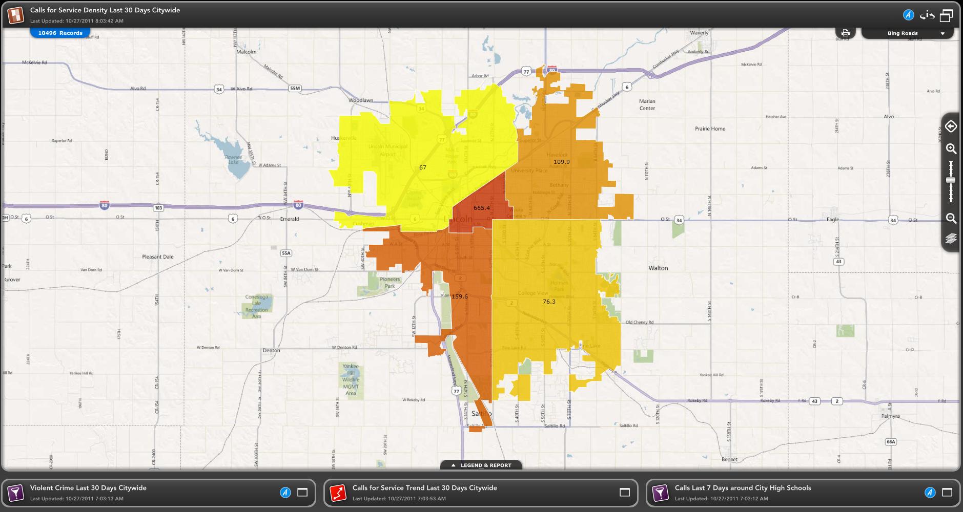
The Density Widget icon, title of the widget and Last Updated date are in the same spot in the Maximized State as they were in the Minimized State.
-
The blue Analysis Mode 'A' icon and flip widget 'i' icon are in the same spot in the Maximized State as they were in the Minimized state. They also have the same functionality.
-
Next to the flip widget icon you can see a double window icon instead of a single widget icon. This icon collapses the widget back to its Minimized State.
-
Below the Last Updated date you can see the number of records being displayed on the map.
-
In the top right corner of the map you can see the Print icon which will let you print certain features of the widget.
-
Next to the Print icon is the Map Styles drop down menu. The map styles you have available to you will depend upon your Dashboard's configuration.
-
The Map Toolbar is displayed on the right side of the expanded widget map.
-
The Legend & Report tab on the bottom will allow you to view expanded charts and reports for the widget.
Density Map Widget in its Maximized State.
Related Links:


